My eye is still in recovery mode and going well; but I'm still taking it carefully. So one of the tasks I could do was to print a sample of our Mistral font - 48pt and 72pt (above). This is gorgeous metal type for doing smaller posters and cards.
We were fortunate to buy a type draw with these two type sizes in it when we bought a cabinet of draws. We had not seen this font before. Some of the type was quite dirty and had not been cleaned properly before being returned to the draw - printing samples helps with the cleaning process.
Given the size of the type there is not a lot for doing extensive work; but the work done with it will always have a special unique quality to it. Interesting that some of the numbers are upside down in the sample - could have proofed it better?
It took me all day to set up, print and diss the type for the two samplers - I needed to print the 72pt on two cards - hence two lots of locking up and printing - but worth having these in the sample folders created by Fiona.
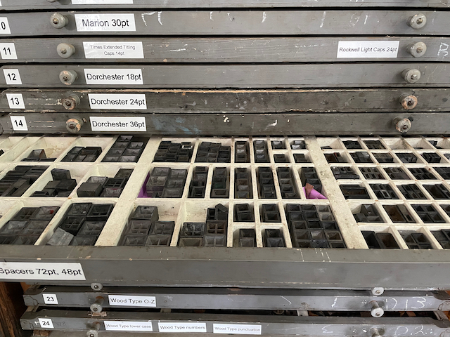
A draw of 72 and 48 point spacers used in the lock up.


this sent me off to learn more about the font, which was designed in the mid-1950s ... looking back at your sample, the letters do "connect" to a significant degree ... and the article I read noted that the type also has special ligatures which are not available in the online version of the font ... fascinating
ReplyDeletelooking back at your type sampler, I found the letter "f" has an added bit at the end to enable a link-up with other letters ... something I wouldn't have noticed before
what a score!
ReplyDeleteGreat font and so happy to hear that you’re healing up well.
ReplyDeleteMC and J - a very good find indeed. Cheers. b
ReplyDelete